

My Role:
UX/UI Designer (End-to-End)
Timeline:
1 Month
Tools:
Figma
Optimal Workshop
Platform:
FieldEdge Mobile (B2B SaaS)
Team:
Virginia Morgan: Senior UX Designer (Design review)
Nelson Ventura and Lisa Acevedo: Product Manager
Engineering Team: Development collaboration
Overview
The FieldEdge mobile app is used daily by technicians in the field to manage their work orders, timesheets, and job details. However, the existing homepage was not meeting their needs. Essential actions like clocking in/out were hidden, work orders were buried within separate pages, and technicians had no quick view of their day. This slowed them down during already busy schedules.
My goal was to redesign the homepage to bring clarity, accessibility, and efficiency to their workflow—reducing taps, surfaces important information earlier, and helping technicians complete their tasks with ease.
The Problem
Technicians often work in fast-paced environments where every tap and every second counts. The previous homepage created friction hindering user experience and efficiency. This outdated design contributes to 4 critical issues.

Homepage

Timesheets
1. Clock In/Out Was Hidden
Technicians frequently forgot to clock in/out because the action was not visible on the homepage. This created payroll issues and added administrative overhead.
2. Timesheet Confusion
The previous design lacked clarity around timesheet status, making it difficult for technicians to understand or review their hours.


Homepage
Navigation Side Panel
3. Work Orders Required Extra Navigation
Work orders arguably the most important part of their day, were not accessible from the homepage. Technicians had two extra taps in order to see their assignments.

4. No Quick Access to Job Information
Important details like job address, schedule, and customer notes were only available after opening a full work order.
During ideation, I saw that merging the Work Order screen with the homepage would better support technicians’ workflow and align with leadership’s goal of driving more homepage usage.
Work Order Screen
Research & Discovery
To understand technicians’ pain points, I conducted:
User surveys to identify what information technicians need first when starting their day
Usability testing on the previous homepage to identify friction points
Workflow analysis to understand the sequence of actions a technician performs throughout the day
Key Insights:
Technicians want everything they need for the day immediately visible.
Clock in/out needs to be front-and-center, not hidden.
Quick-glance information (address, schedule, assignment summary) should appear without tapping into a full work order.
The homepage should serve as a dynamic dashboard, not a static landing page.
Design Goals
1. Reduce taps for core actions
Make clocking in/out and viewing work orders immediately accessible.
2. Surface daily work visually
Present work orders directly on the homepage with at-a-glance info.
3. Increase efficiency
Empower technicians to take action quickly, reducing friction during busy workdays.
4. Improve clarity
Redesign the timesheet area to be more understandable and actionable.
Ideation & Iteration
Given that technicians primarily use the Work Order screen, I explored the idea of combining it with the homepage to streamline their workflow. This led to the creation of several low-fidelity design concepts, each aiming to address the identified issues.
A few examples of my low-fidelity designs


Final Design

Solution 1
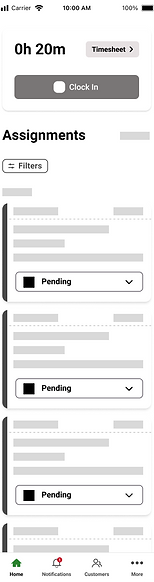
Clock In/Out - Now Highly Visible
The clock in/out button is now placed at the top of the homepage, making it impossible to miss. Users receive visual confirmation of their status and next steps.To further enhance this, incorporating a timer and a timesheet button directly on the homepage can streamline access to time-related information.
Solution 2
Assignments on the Homepage
Technicians can now see all their assigned work orders directly on the homepage—no extra navigation needed.
Each work-order card includes:
-
Customer name
-
Job address
-
Scheduled date & time
-
Status
-
Quick-glance details
This dramatically reduces taps and improves workflow speed.
Including a counter for assignments and a visible "Add New" text button to create a new assignment. Additionally, a modern filter design enhances the process of sorting and organizing assignments.

Solution 3
Quick Access to Essential Information
Technicians now get a condensed, readable view of what they need without diving into full work order pages.
By long-pressing an assignment card on the homepage, technicians can quickly access essential details.
Preview drawer includes
-
Assignment details
-
Customer contact information
-
Past service history
-
Agreements
-
Equipments
This feature reduces the number of taps required and ensures technicians are well-prepared for their tasks before traveling to customer location.

Solution 4
Clearer Timesheet Section
A redesigned timesheet, which displays hours, status, and next steps in a cleaner, more intuitive way. Additionally, I've incorporated a graph to provide visual insights.
Impact & Results
The redesign was met with strongly positive reactions from both users and stakeholders.
Technicians reported:
-
The app felt faster
-
The new homepage was more intuitive
-
It was easier to stay on top of work orders
-
Clocking in/out was no longer an issue
Stakeholders shared:
-
Higher engagement
-
Increased adoption of key features
-
Excitement for rollout and implementation
98%
of participants find the new homepage to be intuitive
87%
of participants found the preview drawer to be a valuable feature
70%
Reduction of the number of taps
Although full analytics will come after implementation, both internal and external users expressed high enthusiasm and recognized immediate improvements in usability and workflow.
FieldEdge is developing a new mobile app to resolve backend issues; these designs are part of that process. The app is expected to be released in 2025.
Reflection
This project gave me the opportunity to own a redesign end-to-end, from research to final high-fidelity designs. Working closely with project managers, engineering, and a senior designer taught me how to balance user needs with technical feasibility and business priorities.
Key Takeaways:
-
Designing for technicians requires respect for speed and clarity
-
Small changes to hierarchy and visibility can dramatically improve workflow
-
Cross-functional collaboration strengthens design decisions and final outcomes
This redesign reaffirmed the importance of building mobile experiences that prioritize efficiency, visibility, and user confidence, especially for users working in high-pace, real-world contexts.