
My Role:
UX/UI Designer
Timeline:
3 Months
Tools:
Figma
Optimal Workshop
Platform:
FieldEdge Mobile (B2B SaaS
Team:
Virginia Morgan: Senior UX Designer (Design direction & review)
Nelson Ventura: Product Manager
Engineering Team: Development collaboration
Goal:
Enhance the “Work Order Details” experience for field-service technicians to reduce job completion time, improve usability, and address key mobile bugs impacting speed and workflow efficiency.
Objective:
Simplify and streamline the “Work Order Details” screen used by field technicians, reducing unnecessary steps and taps, improving usability and adoption.
Outcome:
• 80% decrease in number of taps to complete core flows
• 94% of technicians rated the new design as “more intuitive” (survey of 242 participants)
Background

About FieldEdge
FieldEdge by Xplor is a B2B SaaS platform that helps field-service businesses (HVAC, plumbing, electrical) manage scheduling, dispatching, invoicing, and payments — all in one system.
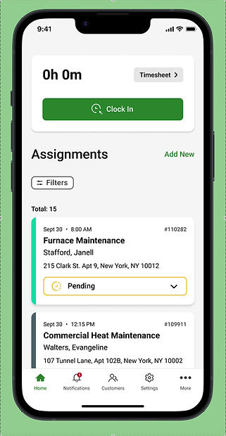
Technicians rely on the FieldEdge mobile app to manage their daily jobs while on-site. The Work Order Details screen is the most frequently accessed view, containing customer info, job descriptions, parts, and payments.
The Problem
Technicians were struggling with unnecessary steps and friction within the Work Order Details screen:
Problem 1
Too many taps required to reach critical information
Problem 2
Slow mobile performance and unclear visual hierarchy
Problem 3
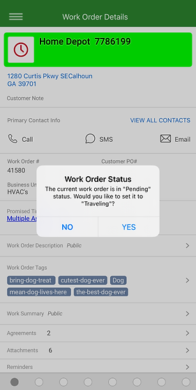
Mandatory status changes (e.g., marking jobs “Working”) just to view details
Problem 4
Excessive pop-ups and permission requests interrupting workflow
These issues increased job completion time, created frustration in the field, and led to inaccurate workflow data.
What do Technicans want?
INSIGHT
It would be very helpful to have more than the main technician on a work order be able to edit the invoice and work summary if applicable.
INSIGHT
When multiple technicians are assigned to a work order, each technician should be allowed to complete the work order independent of the other. All technicians should be able to pull up previous work orders assigned to them and completed regardless of being primary or secondary technician.
INSIGHT
Replacing dots in lower bar on iOS mobile phone app with actual icons would help a lot in navigating through the work orders more efficiently.
INSIGHT
To many screens to navigate. Needs to be simple for the techs in the field as most of us are not tech savvy.
INSIGHT
I would like the app to stop freezing all the time. I have to reload my app at least 5 times a day.
Research & Discovery
Methods
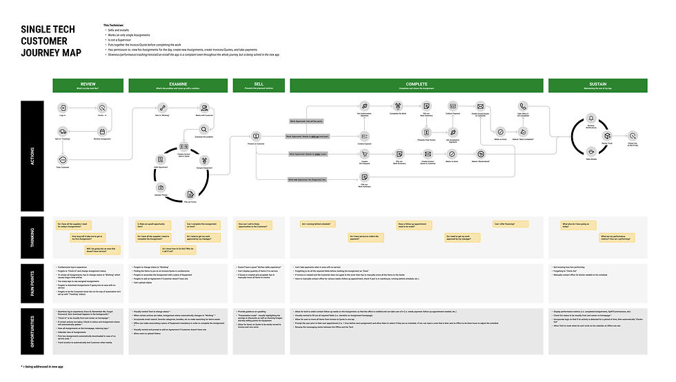
Journey Mapping:
Documented the technician workflow from job assignment → on-site service → completion.
Surveys
On July 23, 2024, we conducted 3 surveys on Optimal Workshop, with a total of 242 participants to identify usage patterns and pain points. July 29, 2024 was the last day of the survey.
Usability Testing
Observed 6 technicians completing core flows to measure number of taps and task completion time.
Key Insights
INSIGHT 1
80% of technicians wanted faster access to customer info and job descriptions.
INSIGHT 2
Secondary techs needed read-only access for quick status checks.
INSIGHT 3
The carousel navigation was inefficient and confusing due to lack of labels.
Design Goals
1.
Simplify navigation and reduce number of taps.
2.
Improve speed and eliminate redundant modals.
3.
Provide read-only access for assistant technicians.
4.
Streamline hierarchy to show key information first.
Design Process
1. Ideation & Wireframing
-
Created low-fidelity wireframes exploring different layouts and navigation models.
-
Focused on exposing critical information above the fold.
2. Collaborative Feedback
-
Weekly design critiques with Senior UX Designer Virginia Morgan for direction and validation.
-
Iterations based on product management and engineering feedback for technical feasibility
3. High-Fidelity Design & Prototype
-
Built interactive prototypes in Figma showcasing carousel redesign and contextual actions.
-
Shared with field users for remote testing sessions.
4. Usability Testing
-
Measured time-to-task, number of taps, and qualitative satisfaction.
-
Conducted comparison between old vs. new design.
Solution
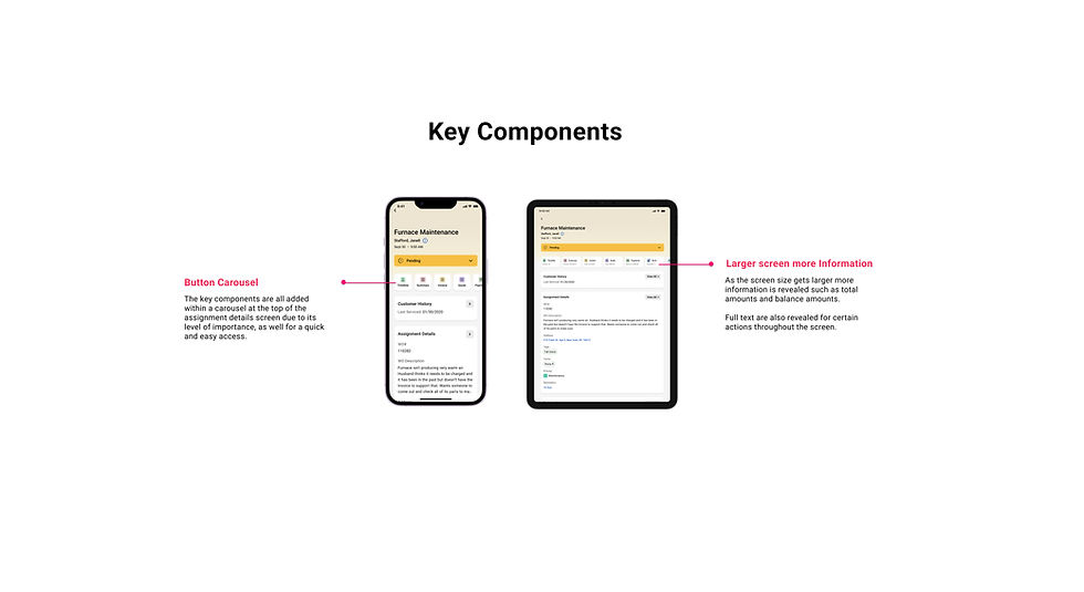
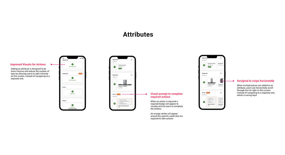
The redesigned Work Order Details screen introduces:
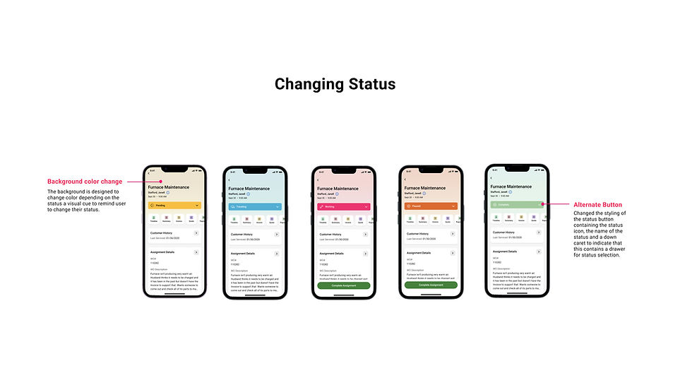
1.
Simplified carousel with clear labels and fewer navigation layers.
2.
Instant visibility for Assignment Attributes
Inline CTAs (e.g., “Start Job,” “Add Agreement”) replacing hidden buttons.
3.
4.
Read-only mode for secondary technicians.
Reduced modals and faster load performance through optimized interactions.
5.
Results
FieldEdge is developing a new mobile app to resolve backend issues; these designs are part of that process. The app is expected to be released in 2025.
80%
decrease in the number of taps
94%
of surveyed technicians rated the new layout as “more intuitive.”
Reduced
average job completion time and fewer reported mobile bugs post-testing.
The redesign was
approved
for implementation in the 2025 FieldEdge mobile app release.
Reflection
This project reinforced the importance of research-driven iteration; listening to user feedback, validating assumptions, and collaborating across disciplines.
Working on this project for three months gave me valuable insights across multiple stages of the design process and deepened my understanding of user experience. Collaborating with a teammate also broadened my perspective and introduced stronger quantitative insights that elevated the overall research. This experience strengthened my ability to empathize with users while sharpening both my strategic thinking and research skills.
As a UX/UI designer, I learned how to balance user needs with business goals, and how even small interface optimizations can dramatically improve daily productivity for field workers.