
FieldEdge Mobile Redesign
Reshaping core mobile experiences for field service technicians.

Primary Role:
UX/UI Designer
Timeframe:
2024 - Present
Company Size:
500+
Industry
Field Service Software


Executive Summary
I led the end-to-end redesign of FieldEdge's core mobile experience, the three screens technicians rely on most: Homepage, Navigation, and Work Order Details. The redesign was grounded in two research studies spanning 152 and 242 participants, surfacing the pain points that shaped every design decision. The result: an 80–90% reduction in taps to complete key tasks, with 94–98% of technicians rating the new screens more intuitive than the original. A new preview drawer feature was found valuable by 87% of technicians surveyed. I collaborated closely with a senior designer, product manager, software architect, and engineering team throughout, and helped push back on a compressed timeline to preserve room for real user research.
Background
What FieldEdge is, and where technicians spend their day
FieldEdge by Xplor is a B2B SaaS platform that helps field-service businesses (HVAC, plumbing, electrical) manage scheduling, dispatching, invoicing, and payments all in one system.
Technicians rely on the FieldEdge mobile app to manage their daily jobs while on-site. The Work Order Details screen is the most frequently accessed view, containing customer info, job descriptions, parts, and payments.
The
Challenge
But the app wasn't designed around how they actually work. Critical actions like clocking in, viewing assignments, and updating work orders require too many taps, force unnecessary status changes to view information, and give secondary techs no way to access shared jobs. The result is a cumbersome, tap-heavy experience that adds friction to nearly every task a technician performs, costing time, creating payroll errors, and making an already demanding job harder than it needs to be.
A day in the life of a FieldEdge Technician
Imagine you're a technician starting your day. Before you leave the house, logging in becomes a hassle; a cumbersome sign-in process stands between you and your first assignment. Once you're in, you have to dig through so many taps just to see what's on your schedule today.
You head on over to your first job. Somewhere between parking the truck and knocking on the door, you forget to switch your status to "Working", and now the clock is logging in some bogus time against a job you haven't even started yet! If you're heading into an area with no signal, you'd better remember to download your assignments first, and remember to let the customer know you're on your way, because if "Traveling" status isn't set up to notify them automatically, that call falls on you.
On-site, you're building a quote. Finding the right items to add feels more cumbersome than it should, and if the customer doesn't have an agreement on file, remembering to add one is one more thing you have to catch yourself doing. If the quote gets accepted, you now have to manually move every item over to the invoice line by line.
If you're out of signal range, you can't take a payment at all. If the customer doesn't agree to the work after all, you're back to manually shuffling items between invoice and quote. And if something comes up mid-job, a part you need becomes a scheduling conflict, a follow-up appointment, there's no way to flag it in the app. You're calling the office directly, every time.
By the time you're wrapping up, you still have to remember to mark the assignment "Done," double-check that every required field is filled in, and clock out. One more status that's easy to forget in the shuffle, and at the end of it all, you have no real way of knowing how your day measured up.
None of these moments are catastrophic on their own. But stacked one after another, job after job, they turn a technician's day into a string of small workarounds, and it's exactly that accumulation of friction the redesign set out to solve.
Homepage
-
Clock in/out was hidden, causing missed clock-ins and payroll overhead
-
Timesheet status was unclear, hard to read at a glance
-
Work orders took two extra taps, to reach from the homepage
-
Job info wasn't visible, until a full work order was opened

Homepage

Timesheet
Homepage
Navigation
-
Key features were buried, behind a hamburger menu, adding a tap to reach anything

Work order details
-
Sub-tasks were locked in a carousel, forcing swipes past sections not needed
-
Unclear hierarchy, made the screen hard to scan under time pressure
-
A forced status change, was required just to view details
-
Too many taps/steps (cited 8x), the single most common open-ended complaint
Project Constraints
-
Fast timeline with limited UX infrastructure
-
Pressure from leadership; limited room for research or testing
-
New engineering team unfamiliar with UX processes
Research & Discovery
Grounding the redesign with evidence
This redesign was informed by two research studies conducted with FieldEdge users:
December 2022:
An Optimal Workshop survey of 152 participants (owners, dispatchers, techs, sales reps, and office admins; 40% technicians), focused specifically on how Work Order Details was being used and what information mattered most within it
July 2024:
A follow-up Optimal Workshop survey of 242 participants across three groups, evaluating a broader set of mobile workflows including Work Order actions, customer management, and navigation-adjacent tasks
Together, these two studies gave a fuller picture: the first pinpointed exactly what technicians needed from Work Order Details, while the second validated those findings at scale and expanded the research into navigation and broader mobile workflows.
Assumptions vs Reality
Going into this project, there was an internal assumption that technicians weren't tech-savvy. To test that directly, the survey asked technicians to self-rate their comfort with technology; 88% rated themselves as tech-savvy, directly contradicting the assumption. That finding mattered: instead of designing down to a perceived skill gap, we could focus entirely on solving real workflow friction.

We mapped out the technician's journey from receiving the job assignment to completion, documenting every action, decision, and interaction. We intentionally left emotion tracking out of this map because, in a typical journey map, emotion is meant to reveal where the highs and lows are, but for FieldEdge technicians, there weren't any to contrast. Frustration was the baseline at nearly every step of the way.
Single Tech Customer Journey Map
Documented the technician workflow from job assignment → on-site service → completion.
This technician
-
Sells and installs
-
Works on only single assignments
-
Is not a supervisor
-
Puts together the Invoice/Quote before completing the work
-
Has permission to: view assignments for the day, create new assignments, create invoices/quotes, and take payments
-
Slowness/crashing/reinstalling the app is a complaint seen throughout the whole journey, and is being solved in the new app.

Key Insights
1. Information hierarchy
Not all information in Work Order Details carries equal weight. Fields like Property Address, Pinned Notes, and Primary Contact Info were rated most useful, while WO#, Business Unit, and Customer PO# ranked lowest, indicating an opportunity to reprioritize what's shown by default
2. Workflow flexibility
Technicians want to view and act on a work order without being forced into a specific assignment status first
3. Navigation
The carousel format for navigating WO sections was a direct source of frustration! Technicians wanted to jump straight to the section they needed
4. Visibility
Clock in/out needs to be front-and-center on the homepage, not hidden
5. Information architecture
Navigation should reflect how technicians actually think about their tasks, not be organized around a generic hamburger-menu structure"
6. Access and permission
Members repeatedly requested that secondary techs and crew members be able to access and edit a work order on their own devices (cited 7 times)
7. Efficiency
Too many clicks/steps" was the most frequently cited complaint across all open-ended feedback
Design Strategy
What we changed in response to the research
Surface key actions on the homepage
Clocking in/out, viewing assignments directly on the homepage instead of burying them in sub-pages
Replace the hamburger menu with a tab bar
Replace the hamburger menu, which hid every feature behind an extra tap, with a persistent tab bar organized around how technicians actually think about their tasks
Remove the carousel in Work Order Details
Remove the carousel format in Work Order Details, replacing it with cards displayed directly on the page for faster access
Reduce mandatory status-change requirements
Reduce mandatory status-change requirements that blocked technicians from simply viewing information
Reprioritize Work Order Details content
Reprioritize Work Order Details content based on research surfacing high-value fields, deprioritizing low-value ones like WO#
Grant secondary techs full work order access
Grant secondary techs and crew members full access to work order information; directly addressing a recurring, frequently cited research finding
Key Design Solutions
Three screens, rebuilt around how technicians actually work
01
Homepage
Clock in/out now sits front and center, removing the two extra taps it used to take to find it. Today's assigned work orders are displayed directly on the homepage, each card showing customer name, job address, scheduled time, and status, so no extra navigation is needed to see the day ahead.
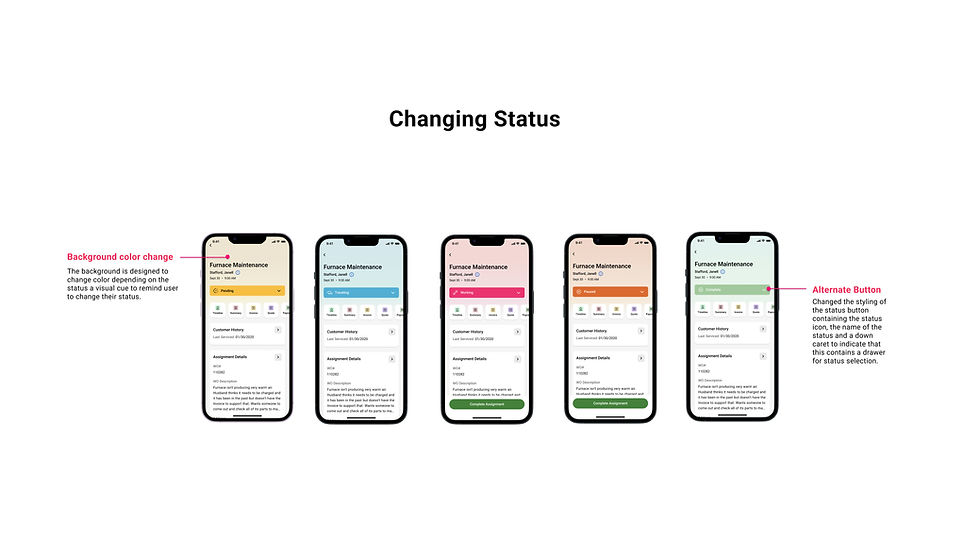
Technicians can also change their status of their assignment directly on the homepage.
Long-pressing any assignment opens a preview drawer with quick access to essential details (job info, customer contact, service history, agreements, equipment) without opening the full work order.
A redesigned timesheet section also gives technicians a clearer, more visual breakdown of hours worked.


Work Order Preview Drawer
Homepage

Timesheet
02
Navigation
The side panel was replaced with a persistent tab bar, giving technicians one-tap access to the Screens they use most: Work Orders, Customers, Settings, and more. Icons paired with labels support quick recognition, and reduced menu depth increases discoverability for high-frequency tasks. A "More" tab currently houses Pricebook, with room to fold in additional features as they're introduced.


03
Work Order Details
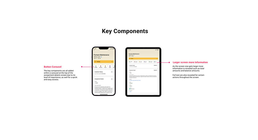
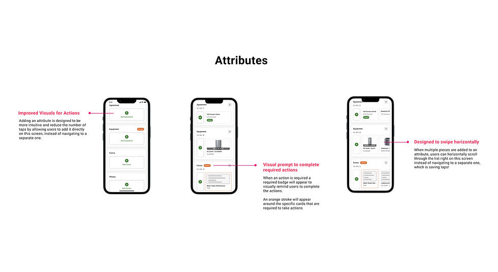
The swipe-through carousel was removed in favor of cards displayed directly on the page. Content was reprioritized based on research, surfacing what technicians said mattered most and deprioritizing rarely-used fields. Mandatory status changes are no longer required just to view details, and excessive pop-ups were reduced. Secondary techs and crew members now have full access to work order information and can add their own work summary.
Outcome &
Impact
Fewer taps, higher confidence, a foundation to build on
Taps to complete
80%
Reduction - Work Order Details
90%
Reduction - Homepage
Rated more intuitive
94%
of technicians - Work Order Details
98%
of technicians - Homepage
Other metrics
87%
preview drawer is a valuable feature
9.5x
Task Completion
95%
Customer retention
Reflection
Fighting for the process
This project went through countless revisions and delays. As timelines slipped, leadership pushed to rush the release to control cost, with a plan that left little room for real research or testing, and user needs were getting pushed out the door. The senior designer and I pushed back, because we knew that delivering without truly understanding what technicians needed would defeat the entire point of the redesign. We asked for a meeting with managers and leadership to make that case directly: that without the time to do this right, the app was going to fail its users instead of improving their day. It worked! They got the project manager to extend the timelines for each initiative. We got the room to do real research, test with actual technicians, and understand their frustrations firsthand.
Our process had another setback. Once a design was handed off to engineers and moved into staging, it went through a code quality check, then QA, then Design QA, but Design QA ended up getting cut from the process. We saw the problem almost immediately! By the time sprint demos came around, we saw so many uncaught design bugs! We had petitioned leadership about this as well to bring back Design QA, and it was reinstated within the project's timelines.